HOW TO CHOOSE COLORS IN HARMONY
THE COLOR-WHEEL
 Color theory
What is a color? It is obvious, everybody knows! And yet, how to define simply with words, a vibration, a wavelength which the retina is sensitive?
No question here to talk again a theory of colors, but to provide simple components and tools that enable you to better match your colors ... and so vary your scrapbooking pages.
 Primary colors, secondary and tertiary
There are 3 primary colors: yellow, cyan (also called primary blue) and magenta (primary red).
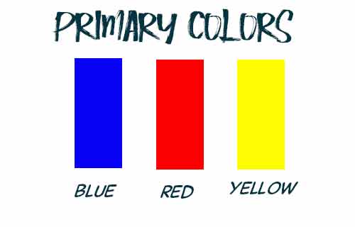
These 3 colors, by mixing, will allow us to recover all the others (at least in theory because the painters know that this is not always easy).
Thus, mixed in equal parts, two primary colors will give the 3 secondary colors:
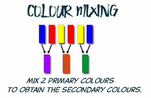
These colors are called : binary colors.
Continue mixing ... a primary color mixed with a next binary color ... gives a tertiary color!
It defines 6 tertiary colors ...
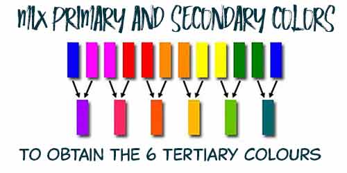
Thus, Red and Violet give the Purple, Blue and Violet give the Indigo, Blue and Green lead to turquoise ...
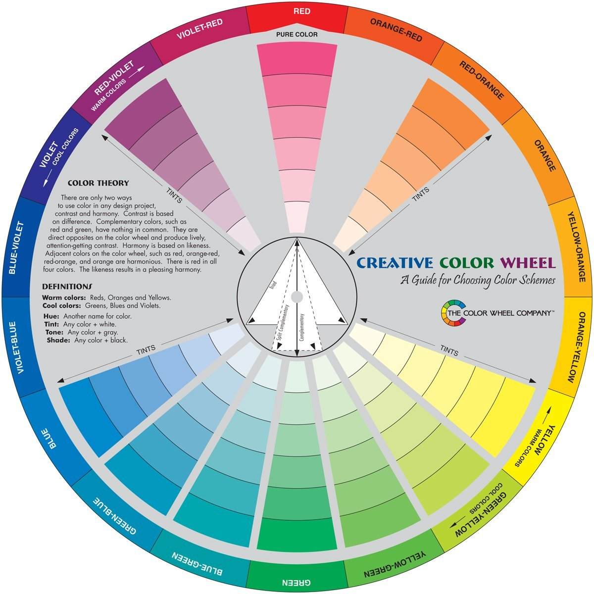
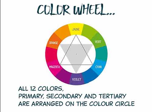
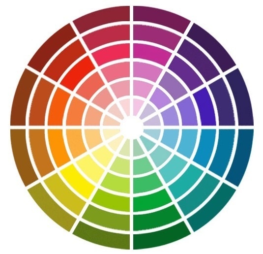
Then count again: 3 primary, 3 secondary and 6 tertiary ... This resulted in 12 colors that can be placed on the color wheel:
 Complementary Colors
Two colors are called complementary when placed opposite on the color wheel.
Red is the complement of green, orange the complement of blue and yellow that of Violet.
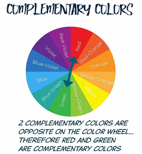
And the human eye is so constituted that in the presence of a color, it looks for its complementary ... This explains the very theoretical harmony of two complementary colors.
In painting, the mixture of 2 complementary colors gives dark gray ... But by adding a small portion of its complementary color, it darkens a color (this is, in painting, the shadow color theory ).
For our purposes, retain for obtaining a maximum contrast we have to juxtapose color and its complement:
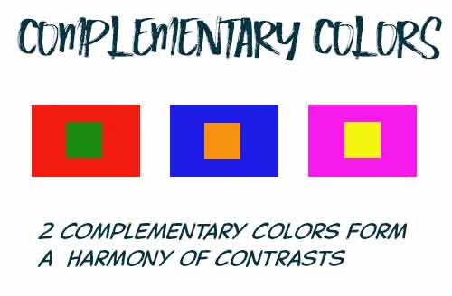
So use the color wheel to enhance the visibility of your colors by playing with the maximum contrast without destroying their relative balance.
New color wheel
By playing on the nuances, the light intensities ... you can get a color wheel fuller rich :
 Color harmonies
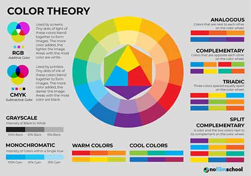
Now that the colors are arranged on the chromatic circle, we can define the different color harmonies .Some are based on contrast, others are oriented towards similar colours.
 Color harmonies based on the contrast
Let me say first that you must choose a base color or dominant color we will find 75% of the picture... the remaining 25% will be for one or the other colors.
![]() With 2 colors: You choose a color and its complement on the color wheel (that which is diametrically opposite on the color wheel. For example, yellow and purple ... as below:
With 2 colors: You choose a color and its complement on the color wheel (that which is diametrically opposite on the color wheel. For example, yellow and purple ... as below:
Harmony in complementary tones |
Harmony reverse complementary tones |
![]() With 3 colors: You choose a basic color (75%). To find the two others, draw an isosceles triangle on the color wheel ...
With 3 colors: You choose a basic color (75%). To find the two others, draw an isosceles triangle on the color wheel ...
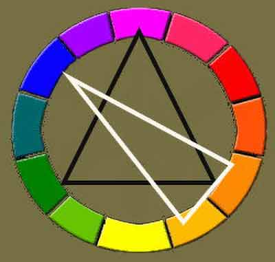
Black triangle : your base color is purple, and the two other colors in harmony are green and orange.
White triangle ... blue is in harmony with the orange and yellow orange.
![]() With 4 colors: Draw on the chromatic circle, a rectangle with the main color as the top. The other vertices of the rectangle give you colors in harmony with the main color.
With 4 colors: Draw on the chromatic circle, a rectangle with the main color as the top. The other vertices of the rectangle give you colors in harmony with the main color.
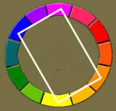
Here are the corresponding harmony:
We obtain strong contrasts, but these colors are harmonics in the color theory. If we plot the rectangle on the "new color wheel" on this page, we would have had tons more "broken" or otherwise more "folded".
 Camaieu Harmony of colors
![]() Monochrome harmony : We say that a harmony is monochrome when obtained with the same color declined in different tones.
Monochrome harmony : We say that a harmony is monochrome when obtained with the same color declined in different tones.
Here, for example, a monochrome blue camaieu:
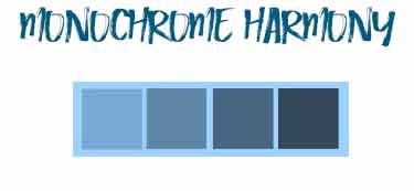
They are found on the color wheel declined on the same radius, the brightest color (towards the center) to the darker (periphery).
![]() Adjacent color harmony : But you can also make a camaieu in choosing adjacent colors on the color wheel. As in this example:
Adjacent color harmony : But you can also make a camaieu in choosing adjacent colors on the color wheel. As in this example:
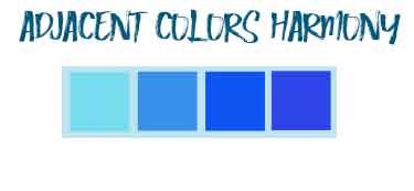
 Harmonies in your pocket...
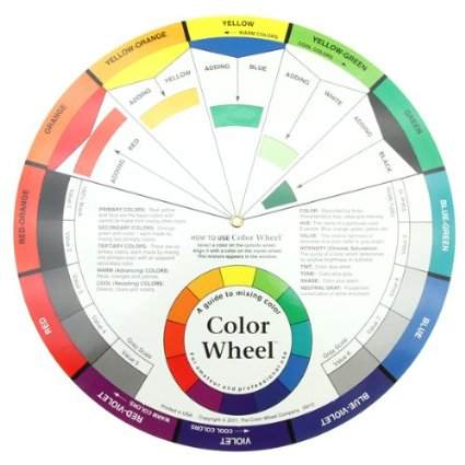
There are many models for these color wheels which are not very expensive and which can avoid you errors in the choice of your colors and harmonies...
I leave you some links to amazon pages where you can judge the price that is proposed to you... It is for me the reference store: before a purchase, I always take a look at what they propose which helps me to decide then!
Here are 3 models which seem to me particularly studied :
 A simple model to learn how to harmonize colors
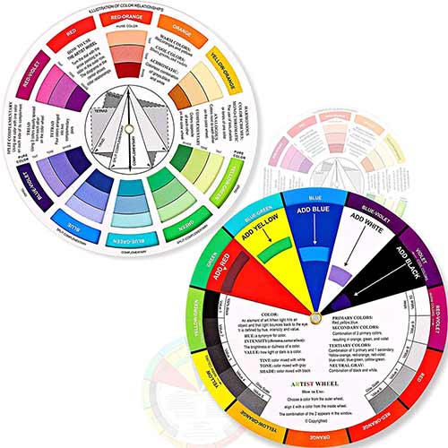
A double wheel with complementary shades and harmonies, with 3 colors and gradients .... It is the ideal model to start and teach the children to choose their colors in harmony. Less than 10$!
 A slightly more elaborate direct reading model
This is the best selling amazon... Also for less than 10$.
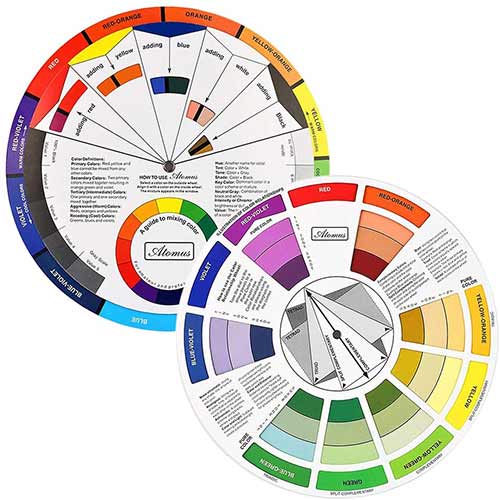
Very complete double wheel, with camaieu gradients and 2, 3 and 4 tone harmonies... A wheel is also dedicated to color mixes : there is nothing missing from a color wheel...
 An original colorWheel with windows
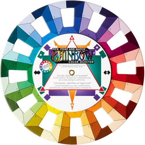
It is an interesting idea to have small windows in this very practical wheel... It does not give you the usual color harmonies but helps you to choose these harmonies...
All around the wheel are windows : you put the wheel on a colored surface (a wall, a piece of clothing, a mat...) and you have directly in front of you the color combinations in which you will choose yours...
All the shades of the same color are presented in both warm and cold tones. This is the Dritz 3169 Rainbow Color Wheel.
Give it a try!
 Some Tools ...
 The color scheme designer
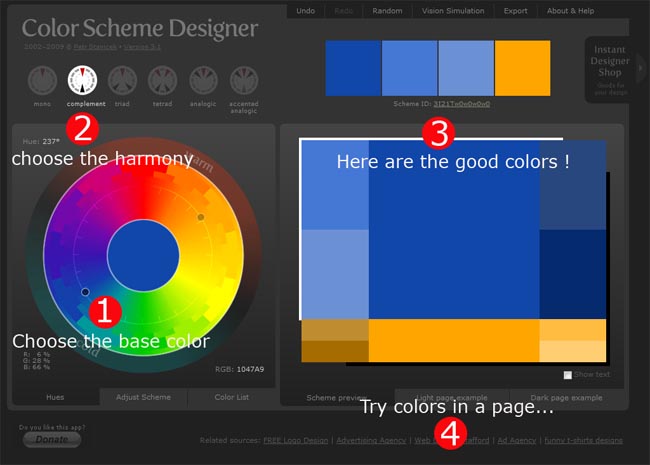
There is a tool that saves a lot of time in research harmonies of color... https://colorschemedesigner.com/csd-3.5/
To use it, click a color from the color wheel (1). This is your base color ...Then choose, just with the top (2), the type of harmony you want : 2 colors (contrast), color 3 (triad) 4 colors (tetrad) or Camaieu (analogic).
Your harmonies appear immediately in the window (3).Now you can select the desired options . Your can try your colors by clicking in (4)
You can also enter the RGB code for your color and get instantaneously your harmonies...
If you want to learn more about this brilliant tools, click above...
You can find this great tool at: http://colorschemedesigner.com/
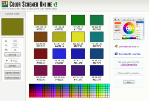
![]() The Color Schemer Online V2 ...
The Color Schemer Online V2 ...
The colorscheme Studio 2 is a professional color application that will help you establish a beautiful color schemes quickly and easily.
It is unfortunately not free but you can download a trial version ... and use it, partially online ...
To learn more about color schemer :
http://www.colorschemer.com/online.html
The Color Scheme Bible:
Inspirational Palettes for
Designing Home Interiors Anna Starmer (Author)
An easy-to-follow and difficult-to-botch guide to the spectrum of home decor...

An AMAZON BOOKS best-seller.
Color Design Workbook:
A Real World Guide to
Using Color in Graphic
Design
AdamsMorioka (Editor)
This book provides readers with the vital information needed to apply color creatively and effectively to their design work...
The color theory is also explained in easily understood language.
Color Works
Deb Menz (Author)
A pull-out color wheel and handy color chips are included.
BUY a COLOR WHEEL
The best and useful.
