2 rules to arrange picture frames
Unity and diversity.
 Don't random hang your picture frames !
It is not enough to drive a few nails here and there and hang frames to obtain the decorative effect you want for your home ...
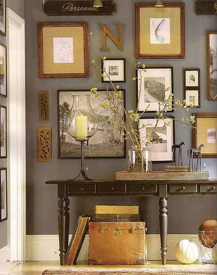
Indeed, a successful design necessarily begin with the optimal development of the items you want to expose for a future audiences. You need them to enter your world and astonish them without disconcerting so that they unconsciously want to go further.
We're right there in the subjective, in the felt : all areas where strict rules can not apply!
 Add rythm to your picture hanging !
To avoid giving the impression of an odds and ends disparate latout, put up a "thread", a "montage", an "intent" to give your picture hanging a certain "cohesion" ...
it's the UNITY factor.
Since the intention is perceived by the viewer your exposure becomes reassuring to him, and makes it available for the rest of his visit.
Similarly, you should avoid monotony in your picture hanging... The sensation of uniformity is indeed daunting and quickly removes the desire to discover more ... So you need to break the unity of your exposure by stooping his "lead" and introducing a small "imbalance" that support the viewer's interest.
It's the diversity factor.
The basic rule of a successful picture hanging is ambiguous: It is made of unity and diversity.
This is called the RYTHM.
 Factors of unity of your picture hanging.
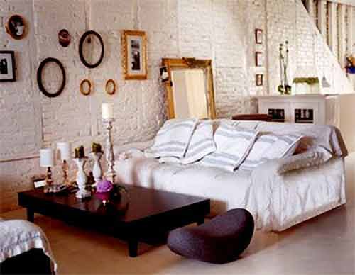
Room unity : Your frames must match your interior.
The latter may be minimal (skinned, modern, strict...): metal frames, white painted are the perfect... If your home is rather old (antique, rustic...) then there are for you gold and polished frames, intricate moldings, the "corner capped" moldings are appropriate ...
Your frames must therefore match with the general ambience of your home.
2.bp.blogspot.com
Shape unity : all the frames together have a similar shape.
This may be rectangular frames (mostly) or oval (especially for family photos ... and in this latter case the intent is more obvious).
younghouselove.com
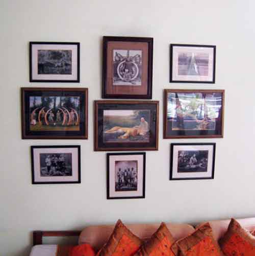
Material Unity : frames or exposed subjects share the material with which they are made (and this matter is highlighted). All your frames are bamboo made, or waxed wood for example ... or all the framed art works are laces ... or watercolors ...
Tiger Hunt in Rajasthan
Topic or theme unity : A common theme link the picture frames.
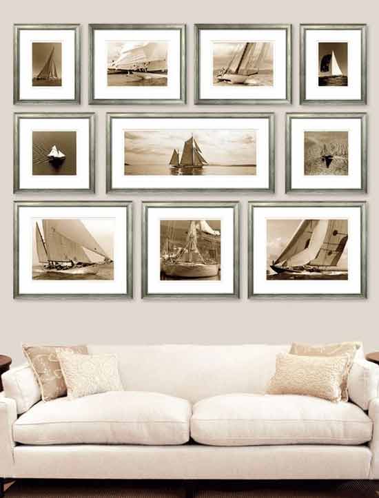
For example, you can group family photos, or you combine oil paintings of streets and houses ... or many marine watercolors ... or even a collection of framed diplomas of your family (including grandparents!) or botanical plates or framed maps ... . It is the "collection" effect .
Color or tone unity : All of your frames are painted with the same color or even all the works on display are in the same tonality (photos of sunsets predominantly orange).
http://julie.elizabethannphotography.com/
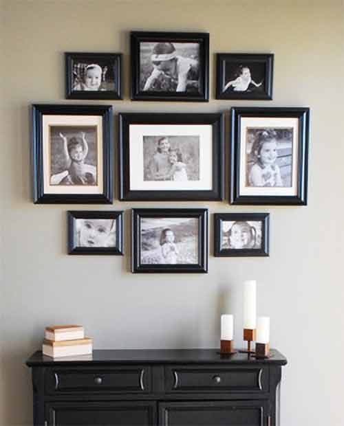
Laying out unity : the arrangement is also an important factor of unity.
Would that in respect of the regularity of your lay out : a large frame symmetrically surrounded by other smaller frames ...
or a series of small frames arranged in a regular geometric shape (oval, rectangle, diamond ...).
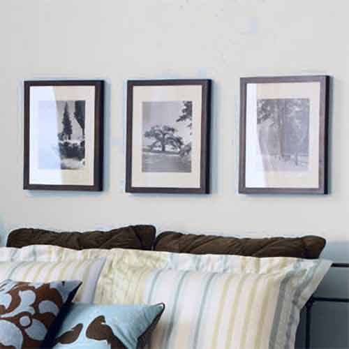
We use also this laying out unity when we align the edges of the frames (or their centers).
Skirmishes
Volume unity : the distribution of masses and volumes is balanced. A large frame is placed next to two small ones... Same concern for mass balance when you have your frames in two rows.The photo below looks unbalanced and looks more like a disparate exhibit than a thoughtful layout!
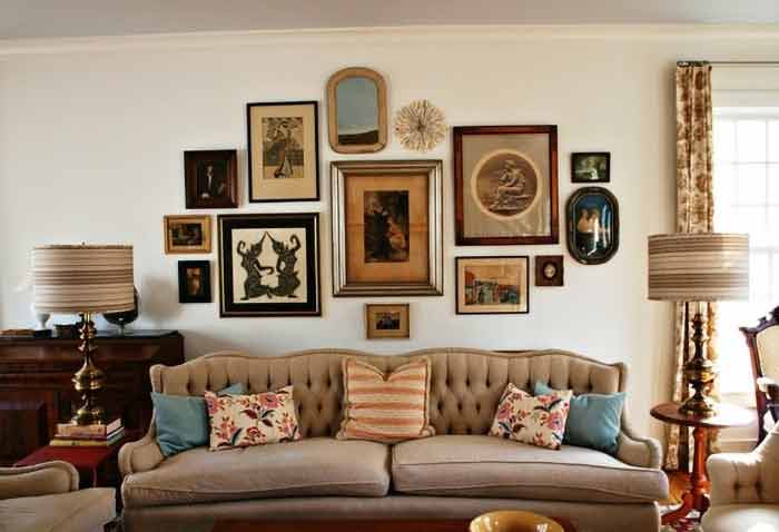
Time unity : Avoid to juxtapose a mosaic of too different epochs or too different inspirations arts. Unless a deliberate choice, do not place a Rembrandt near a Picasso (quoique... it would please me well enough to have 2 or 3 at home!)
 Diversity factors of your lay out
The diversity factor comes to break the setting in order established by the unity factor. It is an intriguing detail, the grain of sand that makes you want to go further, to discover ... Example:
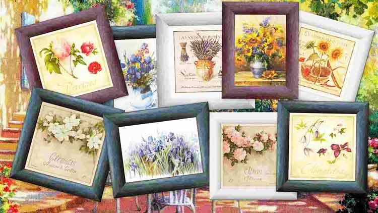
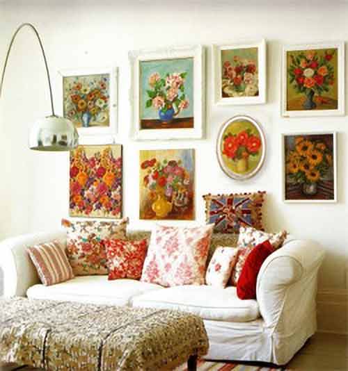
You want to expose a set of bouquets painted in white rectangular frames ... so you have 3 important factors of unity : the subject, color and shape.
To have a not too boring layout, then introduce an element of diversity. It could be a bouquet in an oval frame ... unexpected in this collection.
Here the unity is brought by the shape of the frames, their colour, the subjects (bouquets) and this red colour which comes back as a thread... Of course, we must break with this unity by bringing a little touch of diversity: the oval frame!
At the center of an exhibition of lace framed, you place an old oil painting ... or the framed photo of a lace maker in action ...
You've painted your picture frames in black ... which fits in so well with your interior. In this collection, enter a hacker! A red colored frame will bring a bit of dynamism and movement!
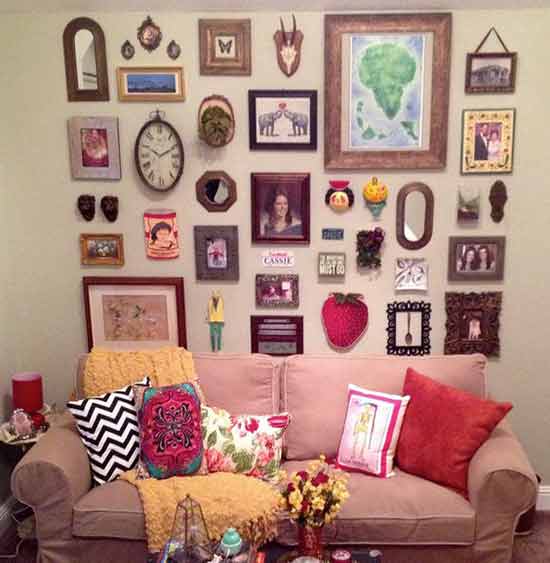
Be careful however not to diversify your layout too much... Excess is harmful in everything! The collage below lacks unity, it is disparate! Too much diversity does not lead to better decorate your interior!
Agra Hotel
